The Power of Typography in Branding
Typography plays a fundamental role in shaping a brand’s identity and influencing how it is perceived by customers. The importance of typography in brand identity lies in its ability to convey the brand’s personality, values, and messaging effectively. By choosing the right fonts, styles, and design elements, a brand can establish a distinct visual identity that resonates with its target audience.
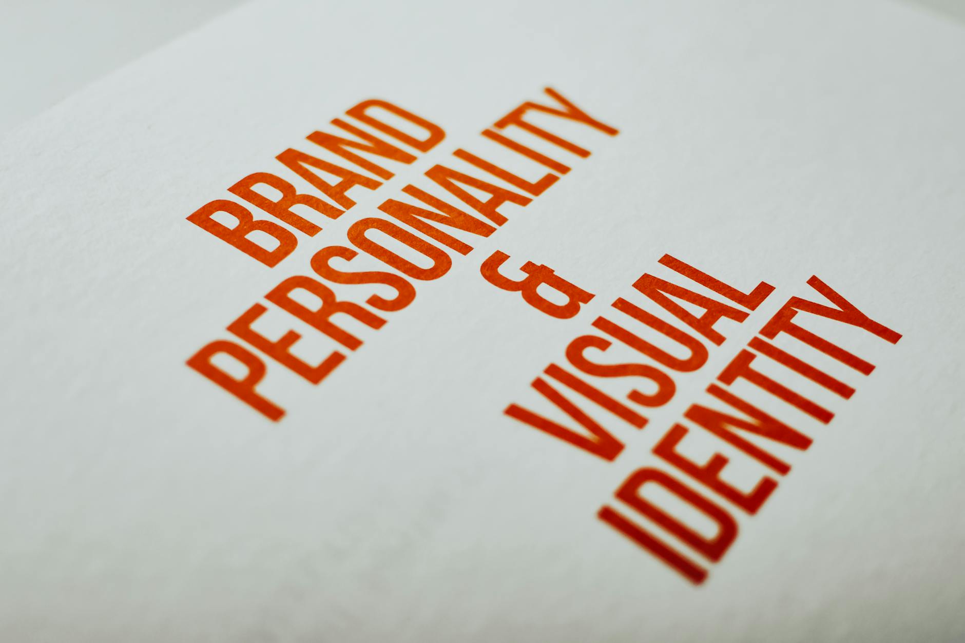
Importance of Typography in Brand Identity
Typography serves as a visual representation of a brand’s identity. The fonts used in logos, marketing materials, and other brand assets help create a cohesive and recognizable brand image. Consistent typography builds brand recognition and fosters trust among consumers, reinforcing the brand’s credibility and professionalism.
The selection of typefaces, font sizes, and spacing conveys specific emotions and characteristics associated with the brand. Whether a brand aims to appear sophisticated, playful, or authoritative, typography plays a crucial role in communicating these attributes to the audience. Understanding how typography influences brand perception is key to creating a cohesive and impactful brand identity.
Impact of Typography on Brand Perception
The choice of typography can significantly impact how a brand is perceived by consumers. Different fonts evoke distinct emotions and associations, shaping the overall brand perception. Serif fonts, for example, convey a sense of tradition and reliability, making them suitable for established brands. On the other hand, modern sans-serif fonts project a more contemporary and innovative image, appealing to younger audiences.
Moreover, the typography used across various brand touchpoints, such as websites, social media, and packaging, influences consumer perceptions of the brand. Consistency in typography reinforces brand identity and fosters brand loyalty. By leveraging typography strategically, brands can establish a strong visual identity that resonates with their target demographic and sets them apart from competitors.
Understanding the pivotal role of typography in branding enables businesses to make informed decisions that align with their brand values and objectives. By leveraging typography effectively, brands can enhance brand recognition, drive engagement, and establish a lasting connection with their audience.
Basics of Typography
Understanding the fundamentals of typography is essential in creating a strong brand identity through design. When it comes to typography in branding, certain key elements play a critical role in conveying the right message to your audience. Let’s delve into the basics: typeface selection, font pairing, hierarchy, and readability.
Typeface Selection
Typeface selection is the foundation of effective typography. The typeface you choose sets the tone for your brand’s visual identity and voice. Selecting the right typeface involves considering factors such as the brand personality, target audience, and the message you aim to communicate.
Different typefaces evoke varying emotions and perceptions. For example, serif fonts are often associated with tradition and elegance, while sans-serif fonts convey a modern and clean aesthetic. It’s crucial to align your typeface selection with your brand’s values and positioning to create a cohesive visual identity.
Font Pairing
Font pairing is the art of combining different typefaces harmoniously to create visual contrast and hierarchy in your design. When pairing fonts, it’s important to consider the style, weight, and spacing of each typeface to ensure readability and aesthetic appeal.
By pairing a sans-serif font with a serif font, for instance, you can create a balanced and sophisticated look. Contrast in font pairings can help guide the viewer’s eye through the content and emphasize key information. Experiment with different font combinations to find the perfect balance that resonates with your brand’s identity.
Hierarchy and Readability
Hierarchy in typography refers to the organization of content based on its importance. Establishing a clear hierarchy helps guide the reader through the information, emphasizing key messages and maintaining visual interest. This can be achieved through varying font sizes, weights, colors, and styles.
Maintaining readability is paramount in effective communication. A well-designed typographic hierarchy ensures that your content is easily digestible and engaging for the audience. Consider factors such as line spacing, paragraph length, and text alignment to enhance readability and create a pleasant reading experience for your audience.
By mastering the basics of typography, including typeface selection, font pairing, hierarchy, and readability, you can leverage the power of typography to strengthen your brand identity and effectively communicate your brand message. For more insights on branding and graphic design, explore our article on branding and graphic design strategies.
Leveraging Typography for Branding
In the realm of branding, typography plays a significant role in shaping a company’s visual identity and influence. Leveraging typography effectively can significantly impact how a brand is perceived and recognized. Let’s delve into three key aspects of leveraging typography for branding: consistency across platforms, expressing brand personality through typography, and using typography to evoke emotions.
Consistency Across Platforms
Maintaining consistency in typography across various platforms is vital for reinforcing brand recognition and establishing a cohesive brand identity. Whether it’s your website, social media channels, marketing materials, or packaging, using consistent typefaces, font sizes, and styles helps create a unified brand image.
By adhering to a set of typography guidelines outlined in your branding style guide, you ensure that every communication piece aligns with your brand’s visual identity. Consistent typography builds trust and familiarity among your audience, enabling them to associate specific fonts with your brand at a glance.
Expressing Brand Personality Through Typography
Typography can be a powerful tool for expressing brand personality and values. The choice of typeface, font weight, and even letter spacing can convey different emotions and characteristics. For example, a sleek and modern sans-serif font might reflect a brand’s contemporary and innovative personality, while a classic serif font could evoke a sense of tradition and heritage.
When selecting typography elements, consider how they align with your brand’s voice and tone. By carefully curating typography that resonates with your brand’s essence, you can establish a strong visual identity that appeals to your target audience and sets you apart from competitors.
Using Typography to Evoke Emotions
Typography has the ability to evoke emotions and create impactful brand experiences. The way text is presented through fonts, colors, sizes, and layouts can influence how the audience perceives and engages with your brand. By combining typography with visual elements, such as images or graphics, you can craft compelling narratives that resonate with your audience on an emotional level.
Consider the emotions you want to evoke in your audience and choose typography elements that support those feelings. Whether it’s using bold, attention-grabbing fonts for a call-to-action or elegant script fonts for a luxurious touch, each typographic choice should serve a specific purpose in enhancing the overall brand experience.
By harnessing the power of typography to ensure consistency, express brand personality, and evoke emotions, businesses can create a compelling and memorable brand identity that resonates with their target audience. Typography is not just about selecting fonts; it’s about crafting a visual language that communicates the essence of your brand effectively and leaves a lasting impression on consumers.
Typography Trends in Branding
In the dynamic world of branding and graphic design, staying attuned to typography trends is essential for creating a distinct and impactful brand identity. Typography plays a key role in conveying the personality and message of a brand. Let’s explore some of the prevalent typography trends that are shaping modern branding strategies.
Minimalist Typography
Minimalist typography has gained popularity for its clean and streamlined aesthetic. Characterized by simplicity and clarity, minimalist fonts focus on essential elements, eliminating unnecessary embellishments. This trend emphasizes the use of negative space, precise alignment, and limited color palette to create a sophisticated and modern look. When implemented thoughtfully, minimalist typography can effectively communicate a brand’s message in a concise and elegant manner.
Handwritten and Script Fonts
Handwritten and script fonts inject a sense of personality and authenticity into brand designs. These fonts mimic the fluidity and character of human handwriting, adding a personal touch to branding materials. Handwritten fonts are versatile and can convey a range of emotions, from warmth and friendliness to creativity and uniqueness. By incorporating handwritten elements in logos, marketing collateral, and packaging, brands can establish a more intimate connection with their audiences.
Bold and Unique Typography Styles
Bold and unique typography styles are making a statement in contemporary branding. Brands are increasingly experimenting with unconventional fonts, creative letterforms, and expressive typographic treatments to stand out in a competitive market. Bold typography commands attention and can be used to emphasize key messages or brand values. Whether through custom-designed lettering, innovative type pairings, or playful typography effects, brands are pushing the boundaries of traditional design to create memorable and engaging visual identities.
Exploring these typography trends offers brand owners valuable insights into innovative design approaches that can elevate their brand presence and resonate with their target audience. By embracing the nuances of typography and integrating these trends thoughtfully, businesses can craft a compelling visual identity that sets them apart in a crowded marketplace.
Best Practices for Using Typography in Branding
When it comes to effective branding, typography plays a crucial role in shaping the perception and identity of a brand. By understanding and implementing best practices in typography, businesses can create a strong visual presence that resonates with their target audience. Here are some key practices to consider when using typography in branding:
Understanding Brand Voice and Tone
Typography should align with the brand’s voice and tone to convey a cohesive message to consumers. The choice of typefaces, font styles, and layouts should reflect the personality of the brand. For instance, a playful and informal brand may opt for quirky and whimsical fonts, while a corporate brand might lean towards structured and professional typography. Consistency in typography helps reinforce brand recognition and fosters a sense of brand familiarity.
Custom Typography vs. Standard Fonts
When deciding between using custom typography or standard fonts, it’s important to consider the uniqueness and distinctiveness that custom fonts can bring to a brand. Custom typography allows brands to create a one-of-a-kind look that sets them apart from competitors. However, custom fonts can be costly to develop and may require additional time and resources. On the other hand, standard fonts are readily available and cost-effective, making them a practical choice for small businesses or startups with limited budgets.
Accessibility Considerations in Typography
Accessibility in typography is essential to ensure that the brand’s message reaches all audiences, including those with visual impairments or reading difficulties. Brands should prioritize legibility and readability when choosing fonts and type sizes. High contrast between text and background colors can enhance readability, especially for individuals with visual impairments. Additionally, adhering to accessibility standards, such as WCAG guidelines, can help create an inclusive brand experience for all users.
By incorporating these best practices into their typography strategies, businesses can effectively leverage typography to strengthen their brand identity and engage with their target audience in a meaningful way. For more insights on creating a cohesive brand identity, consider exploring our article on branding style guide examples to help streamline your branding efforts.
Case Studies in Successful Typography Branding
Let’s delve into some real-world examples of how typography has been effectively utilized in branding to enhance brand identity and communication.
Example 1: Integrating Typography in Logo Design
In this case study, we’ll explore how a carefully chosen typography style can play a pivotal role in creating a memorable and impactful logo. The integration of typography in logo design involves selecting a font that not only reflects the brand’s personality but also ensures readability and versatility across various platforms.
By incorporating distinctive typography elements into the logo, businesses can establish a strong visual identity that resonates with their target audience. Whether it’s a sleek and modern typeface or a playful and whimsical script font, the typography used in logo design sets the tone for the brand’s overall image.
Example 2: Typography in Marketing Collateral
Typography is a fundamental component of marketing collateral, from brochures and flyers to digital ads and social media graphics. This case study illustrates how the strategic use of typography can effectively convey key messages, evoke emotions, and enhance brand recognition.
By employing consistent typography across all marketing materials, businesses can reinforce their brand identity and create a cohesive brand experience for their customers. Whether it’s choosing the right typeface for headlines, maintaining hierarchy for improved readability, or experimenting with font pairings for added visual interest, typography plays a critical role in shaping the perception of a brand.
Example 3: Typography on Packaging
Packaging design is a crucial touchpoint for brands to make a lasting impression on consumers. This case study highlights the significance of typography in packaging, where the choice of fonts, colors, and layout can influence purchasing decisions and communicate brand values.
From product labels to box packaging, typography serves as a visual cue that conveys important information such as product benefits, ingredients, and brand messaging. Whether opting for minimalist typography to convey simplicity and elegance or vibrant and bold typefaces to convey energy and excitement, the typography on packaging plays a vital role in attracting and engaging consumers.
By analyzing these case studies, businesses can gain valuable insights into how effective typography strategies can elevate their branding efforts and create a strong visual identity that resonates with their target audience. For more information on enhancing your brand’s visual appeal, consider exploring our articles on logo design company and branding style guide.
Looking to build something powerful for your business? At Kara Digital, we specialise in crafting high-performance solutions that drive real results. Whether you’re launching a cutting-edge mobile app or need a sleek, responsive website, our expert team is here to bring your ideas to life.


